Elegant Body Horror: A Cover Image Story

For the longest time, Wound from the Mouth of a Wound was a book without a title. Or rather, a book that cycled through many titles and many identities in search of its own. Perhaps fitting for a project born out of my attempts to reconcile the disparate identities I hold, and the ways the world holds them in turn. It would remain that way until the first time I saw Luciano Garbati’s iconic sculpture “Medusa with the Head of Perseus” and grew, quickly, obsessed.
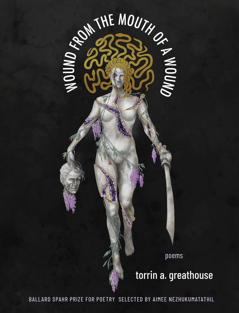
In this image, I saw a mirror. A body so much like mine, a relationship to pain and trauma and survival that rang inside me like a bell. I made a photograph of the statue my phone’s background and would stare at it for hours. Typed the ragged drafts into my phone notes for the better part of six months. It’s from the resulting poem that the book’s title is drawn and from the moment I finished it, I knew that I needed a version of Garbati’s Medusa to be the cover for my book. But I knew this as well: her body, like mine, could not be fully intact. It could not be unbroken.
Nearly a year later, I stumbled across a piece of fan art that brought a clear vision of the cover into my mind. It depicted Fjord, a character from the web series Critical Role, turned to stone and fracturing. Again, an image ringing inside my mind. I found the artist, Cael Lyons’, blog and quickly fell in love with his style. The balance of beautiful and macabre, serene and unsettling.
The moment Milkweed called me to tell me Wound from the Mouth of a Wound had been chosen for publication, I knew I had to ask them to commission Cael to illustrate the cover.
There was an aesthetic I was aiming toward, but couldn’t quite cogently express, which Cael nailed down so precisely in our first conversation—elegant body horror. This became our mode for reinterpreting Garbati’s sculpture as a navigation through the intricate love-hate relationship with the disabled trans body as a site of both trauma and joy.
While I initially expected the drafting process for the cover to be fairly hands-off, with the art director, Mary Austin Speaker, and I briefly discussing the design concept with Cael before he dove into working on it, he made it such a deeply collaborative process. He sent us updates at every phase of the design, from sketching and line art, to shading and coloring; this allowed us all to share ideas, tweak elements of the composition, and gather example images to build toward an ideal version of the final illustration.
The cover is layered with references to the poems within the collection. Wisteria wrapping around Medusa’s body for “On Examination/Dereliction.” The way that as her body splits to reveal the “glimmer of a geode found only in division. / Patient stone blistering into light” a reference to the poem “Essay Fragment: Tragedy Model of Disability.”
But more deeply than that, the cover is a mirror for my own body in so many ways—some I’m sure Cael is aware of and some he couldn’t possibly be. The crack running through Medusa’s eye mimics a scar cutting through my own eyebrow. Her shattered left wrist just like my own, so often strapped into a medical brace. Her jagged hip—my persistent limp. Fragmenting shoulder, just like my own, so prone to dislocation. If the other images were a deep interior chime, seeing her was standing in the center of a struck church bell.
There’s a particular moment from the process that I keep returning to. It was Cael who first suggested the idea of extending the gold which lined the cracks through Medusa’s body into her hair. An idea that Mary ran with, suggesting that her mane of snakes could become a wreath of gold—a halo. That this image of Medusa’s body in fragments could be something akin to a saint’s icon. I suppose, maybe the reason I keep returning to it is that this moment suggested a possibility that—while my poems reach toward it—some small part of me thought could only be true in a world of my own construction. That a body like mine could be rendered divine.

