The Body That Questions: On Art, Beauty, and the Cover of Virgin

As a five-year-old at an art opening, I recall walking up to a painting of myself holding a hanger full of wooden clothespins. My mother had painted it, and it really did look like me. I wandered around the gallery half wondering if I would be recognized, and half wondering what it meant to be holding that hanger: looking out at the viewer, not smiling, almost frowning with thought.
I learned about beauty from my parents. I learned that beauty was more than the bright pinks and reds I favored from the coloring box and could instead be a reflection of experience, in whatever form, whether that be cruel, complicated, or sad. Beauty was a fragment of experience. Beauty could be ugly like early wrinkles or mottled like pigeon feathers. It could be subtle, like the moss green of my mother’s shorts. Reality itself, raw without primer, was beauty.
My child self gravitated to the bright fuchsia of the bougainvillea in my great aunt Tere’s front yard, where I spent a significant amount of time puzzling through the lyrics of “Ring Around the Rosie,” having somehow picked that up from sing-along videos, and I was convinced the wild, monstrous plant had some sort of mythical power, a power I could not define, from a mythos I could not locate. My grandmother, a devout Catholic, had once joked “the gods” were angry when it stormed. Maybe those were the gods who had made the plant that had made the medieval children fall to pieces. Historical memory is a mottled, fragmented thing.

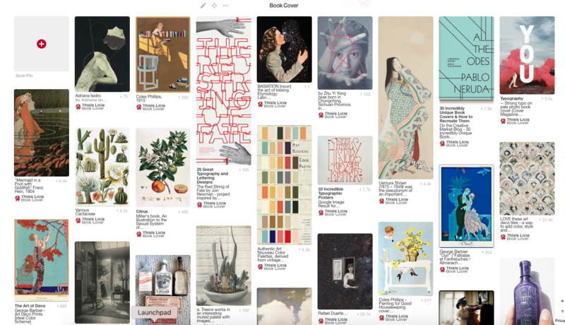
When Milkweed Editions invited my thoughts on cover design for Virgin, I sent them a Pinterest page with visual influences: Victorian pharmaceutical advertisements, turn of the century women’s magazine covers, art nouveau color palettes, autochromes, and vintage illustrations of flora and fauna (mostly cacti)—all motifs of highly polarized femininity that I was trying to capture and reconsider.
I talked about how Virgin is a title that needed a careful cover because it wasn’t just about sexuality or religion. It is also very much about “newness,” about reclaiming the world and recreating it as “virgin territory”—a re-engineered mythical landscape that could describe the complexity of what it feels like to be a young Mexican American woman grappling with femininity within the confines of a Westernized historical narrative.
That’s a lot of academic talk, but the point is: gender, religion, and culture are all built on power. And sometimes the power play is subtle. Sometimes you can get lost in it. Sometimes it can sneak into your relationships or create an affinity for English period pieces.
My principle question was: can femininity (or what we archetypally define as femininity) be powerful? Can one be completely vulnerable (as in naked of thought, feeling, and admission) and find, in that vulnerability, a powerful antidote to something? And where does the body fit in all of that, the body that can also be dangerously vulnerable in the wrong hands? And what about the body that regards itself and seduces others powerfully? The body that can play, the body that can question?
I hoped for a cover that could celebrate a mythological “virgin” that can speak for herself, far away from a voice of objectification (sexuality) or tokenization (naiveté).

So when Milkweed’s art director Mary Austin Speaker sent me a range of cover drafts for Virgin, I gravitated to the bright pink version that so resembled the pink of bougainvilleas and the heat of the Texas sun. It’s the kind of color you can’t ignore, and in a way, wasn’t the project of writing this book about the vibrant color of experience, both actual and hidden?
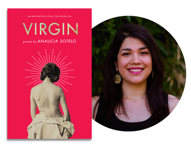
The vintage image of the woman on the cover (“A woman, viewed behind, naked to the waist; revealing mobility of left shoulder,” photograph by L. Hasse after Heimann Wolff Berend) is from a medical examination source that dates from 1859. Mary said she chose this image because the woman is looking away, defining herself rather than seeking the male gaze. That feels true to the task of these poems. I also like the idea that the woman is looking down at midday from a kind of idea balcony.
A modern-day Ariadne plays a huge role in this book, as a woman of perceived innocence who aids Theseus in defeating the Minotaur. This image also reminds me of that. Most readers may notice a modern aura around the woman. I don’t wish to ascribe that aura to any one meaning—it could represent religious imagery or simply the light of the sun. It could represent how much she thinks through everything she does. In this mythos, it could be all these things at once, or none at all. That is the elusiveness and the paradox of art.
I also love how clean the cover is, from the typeface to the lines of the woman’s body, which against the pink casts her until she becomes sculpture-like, a nod to the perfectionism and distance of the character created in these poems.
The stereotype of virginity is that its cause is religious fervor, youthful naiveté, or both. But the character in Virgin has other reasons, too. I will leave it up to readers to decide what those are.
Why is virgin such an embarrassing word, even more than its counterpart (hint: rhymes with door)? Why does no one want to say they’re a virgin, no matter what age? In the ’90s film Clueless, a holographic homage to Jane Austen’s Emma, Brittany Murphy is surprised to hear that Alicia Silverstone, a.k.a. Cher, is a virgin. Cher, who despises high school boys, says, “I mean, I’m not a prude. I’m just highly selective.” Later, Brittany lands the famous line, “You’re just a virgin who can’t drive.” Cher responds, “That was way harsh, Tai.”
Here is this book cover, protected from “way harsh” opinions by fabulous design. Beautiful as a bougainvillea. Naked as an idea. If you read what’s inside, thank you.
PREVIEW: Read “Death Wish,” originally published in the New Yorker.

