Scattered Pieces: A Cover Image Story
Essay by Juliet Patterson
Sinkhole: A Natural History of a Suicide, my first memoir and venture into prose, was a difficult book to write. Guided by the grief and curiosity surrounding my father’s death by suicide in 2009, the book is an attempt to trace a larger legacy of suicide in my familial line. My father’s death marked the third suicide in my immediate family: both my parents had lost their fathers to suicide, a truth that we rarely acknowledged or discussed. When my father died, I began to wonder what had led to these deaths and what my family’s self-destructive history implied.
As I struggled to make sense of the loss, I found myself returning to my parents’ hometown of Pittsburg, Kansas, following a trail my father had left behind. There, I began to carefully research my family’s history, gathering documents, newspaper articles, photographs, and all kinds of ephemera. Over the years that I worked on writing the book, I kept a file filled with these materials on my desk. Whenever I felt lost or confused about how to move forward in the project, I returned to this archive for inspiration and guidance: some of these artifacts eventually made their way into the text.
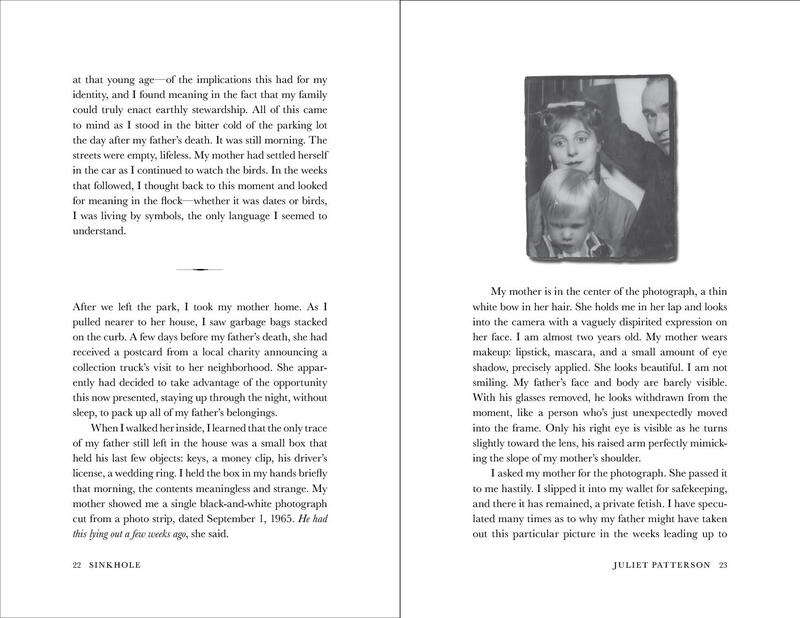
The cover design for Sinkhole owes everything to the vision of Milkweed’s talented art director Mary Austin Speaker, who from the start understood the heart of the story as one of grief, self-reflection and investigation. I had worked with Mary before (she designed the cover for my second book of poetry, Threnody) and knew from that experience that all I really needed to do was to offer her a few simple ideas and then get out of the way. In the case of Sinkhole, I suggested that photographs might somehow play a part, as the analog materials I’d collected along the way had been such an important anchor in my creative process. Since I’d already included family photos inside the book, I didn’t imagine they might also be featured on the cover, thinking it might be better to avoid that repetition. But, when Mary asked me to share a wider collection of family photographs for potential cover design, I knew to trust her.
Beyond all her exquisite instincts as a designer, I often think what sets Mary apart is her uncanny ability to read and understand a text. As a poet, she’s able to transcribe the heart of any story into something deeper. Her insights into the book allowed her to balance two modes that Chip Kidd says designers use to convey an idea quickly—clarity and mystery. “Clarity gets to the point,” Kidd says in his TED talk The Art of First Impressions, but “mystery is a lot more complicated. Mystery demands to be decoded, and when it’s done right, we really want to.”
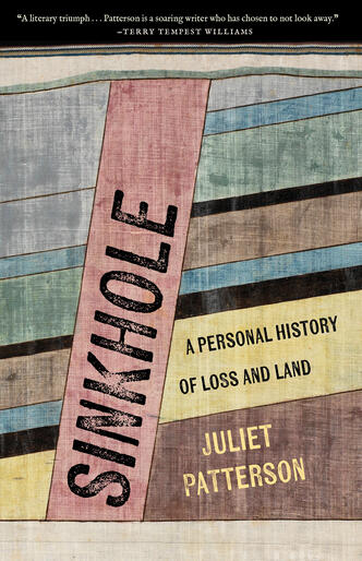
Mary created two versions of a cover, each of them mysterious and compelling in their own right. The covers used similar personal elements, but were strikingly different. One had an air of quietness; the other of daring.
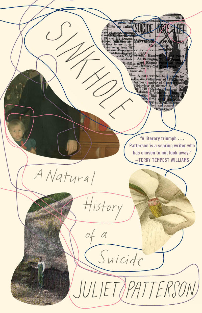
(The first version of the Sinkhole cover.)
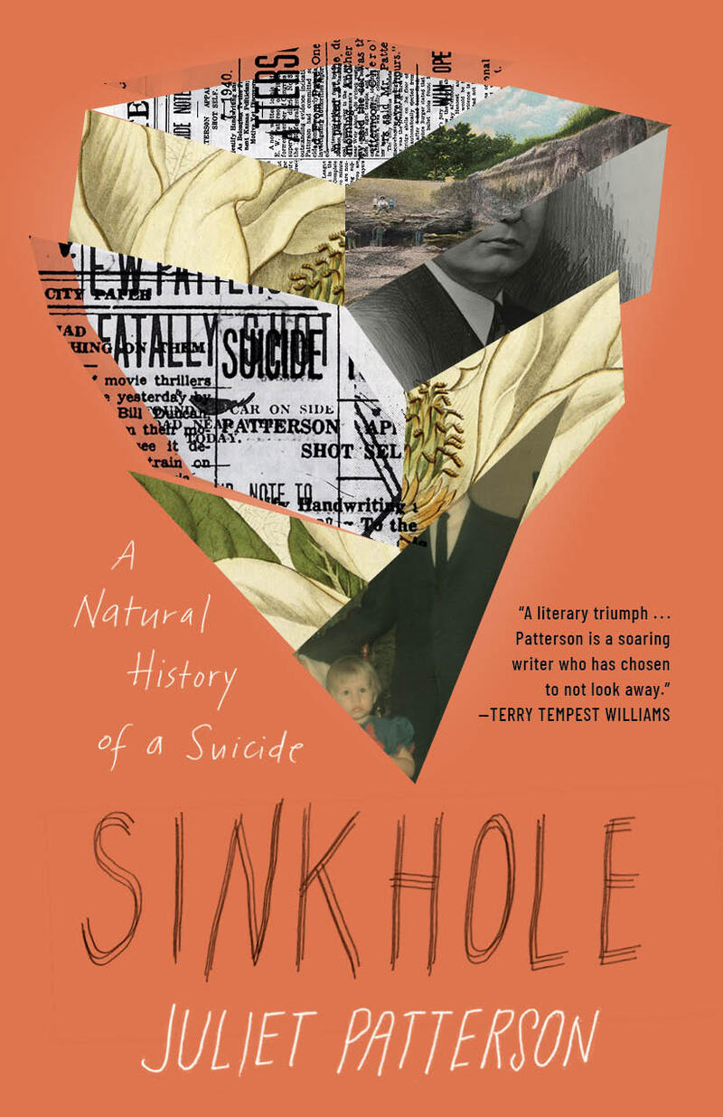
I loved the sprawling, organic lines in the first cover, especially as (in Mary’s words) they were meant to symbolize “the way we find these threads of meaning between things to compose a life.” With its bold color, the second cover had a different quality—more distinctive. It offered mystery in its visual shape and invited readers to make sense of its abstraction. What might readers see in that shape? (“A sinkhole? A tornado? A mine? A coffin? A heart? A flower?” my editor Joey McGarvey asked.) With consensus among the Milkweed staff (and myself), we ended up choosing the second.
The final image for me not only conveys the tactile importance of the personal archive I’d kept, but also embodies the careful journey of the book—which is a kind of mystery itself in deciphering scraps of a personal history. What can be seen in fragments? Or what do they represent? Never exactly one thing.
Here, at the center is my father and me. And above us, strips of magnolias and a familiar collection of other materials, things I’d touched and held along the way: newspapers recounting my grandfather’s suicide, an old picture postcard of a Pittsburg mining pit, a Polaroid from my childhood. Like the book, these are scattered pieces discreetly made into a whole.
